Hi! Welcome to my portfolio website!
Please scroll down...
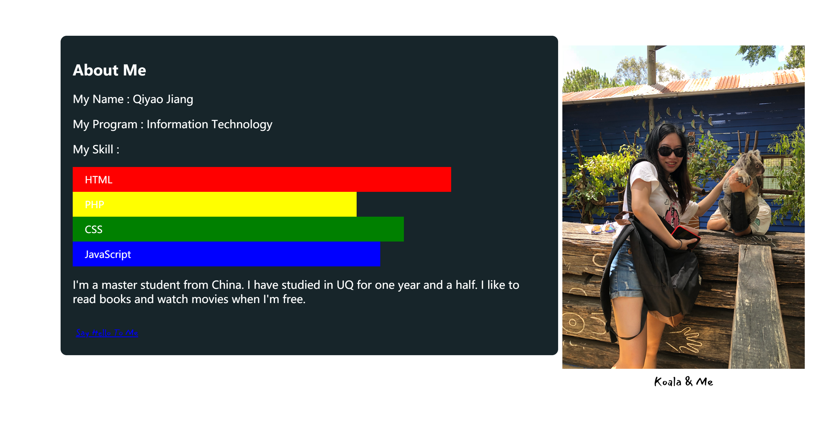
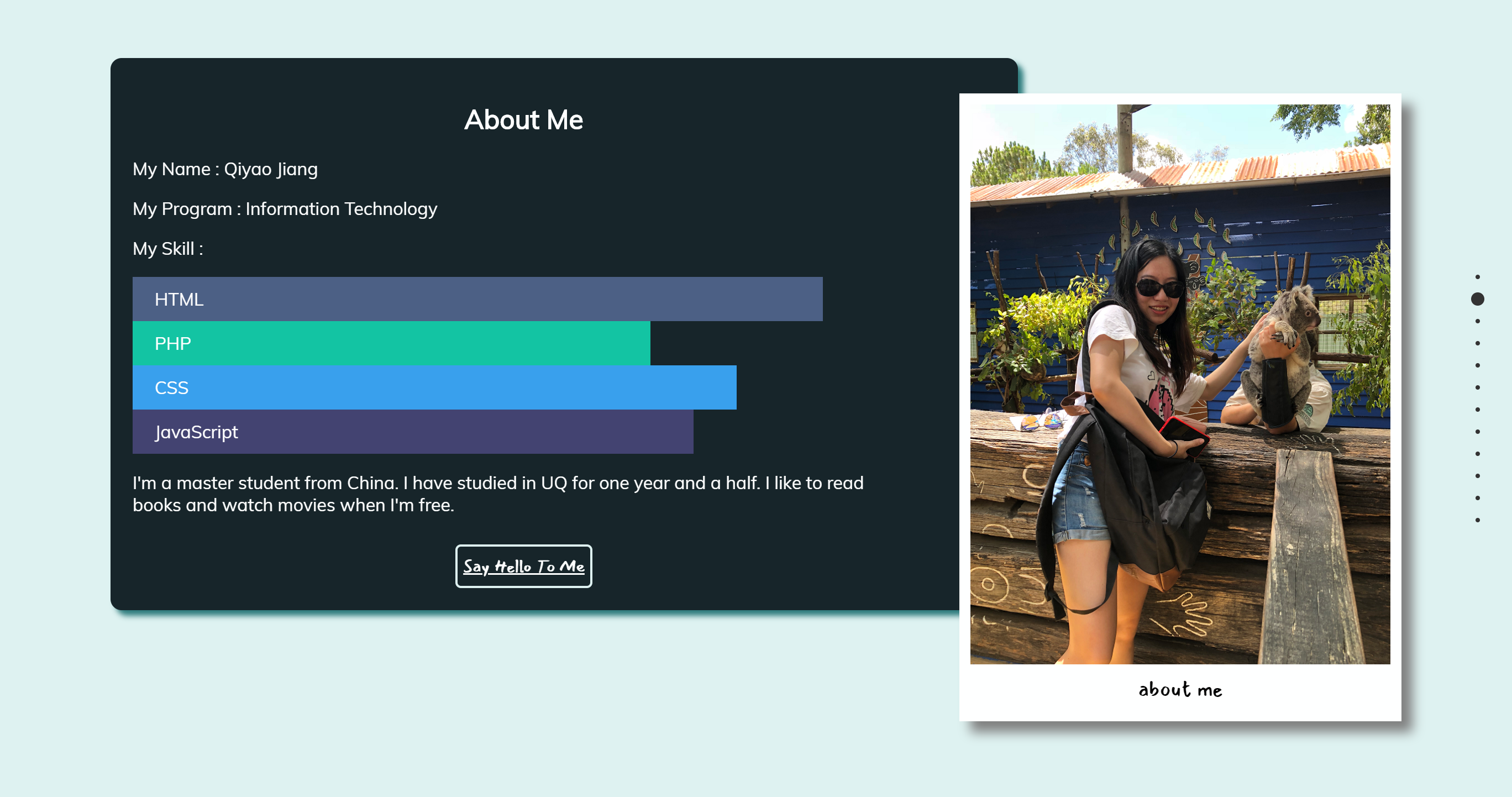
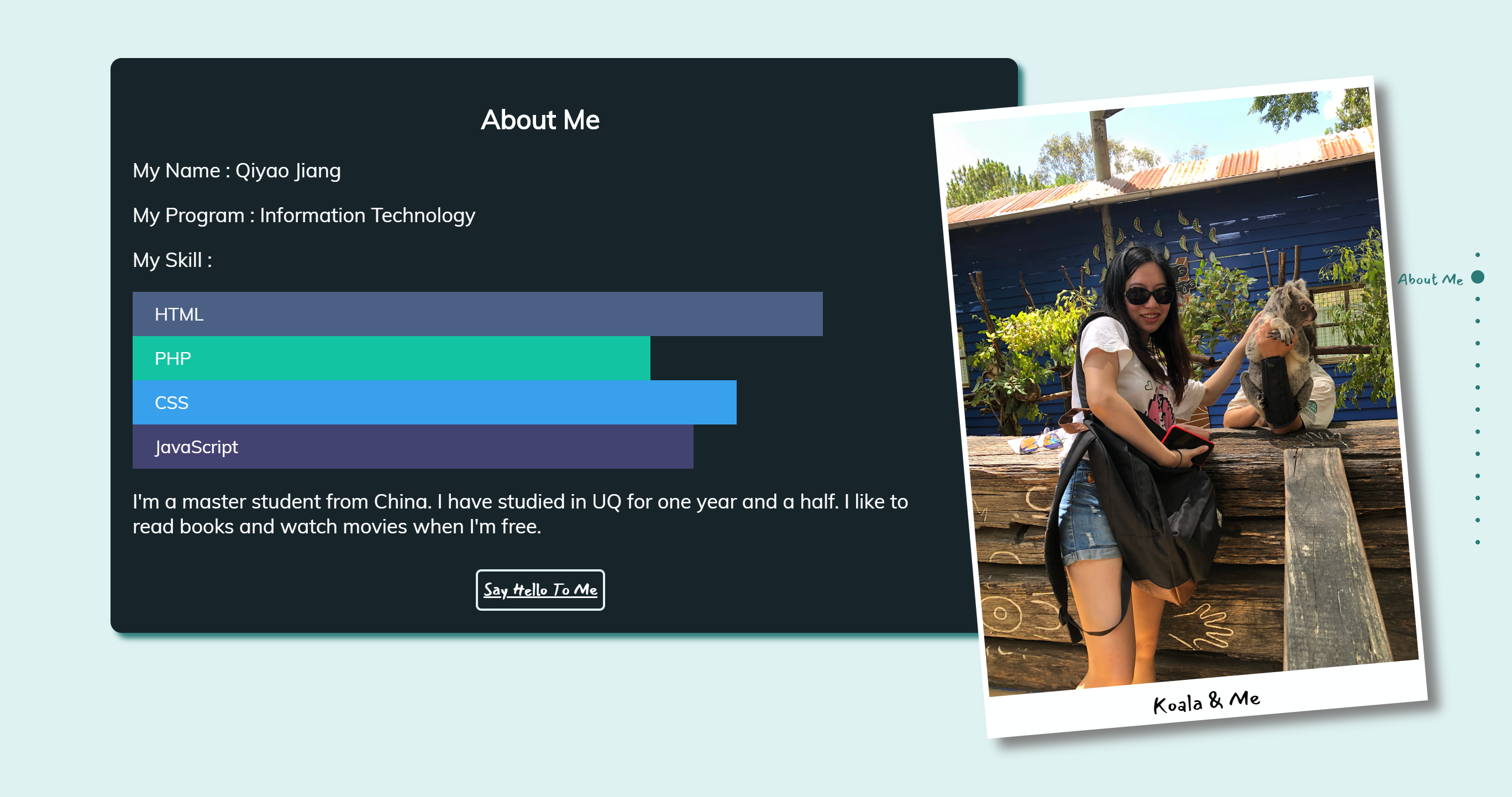
About Me
My Name : Qiyao Jiang
My Program : Information Technology
My Skill :
I'm a master student from China. I have studied in UQ for one year and a half. I like to read books and watch movies when I'm free.
Following are my process and work for DECO7180...
Design Exploration
Our major project of DECO7180 is to implement a web-based application that presents State Library of Queensland data hosted on the data.qld.gov.au portal in an engaging and interactive manner. (Beetson, 2019)
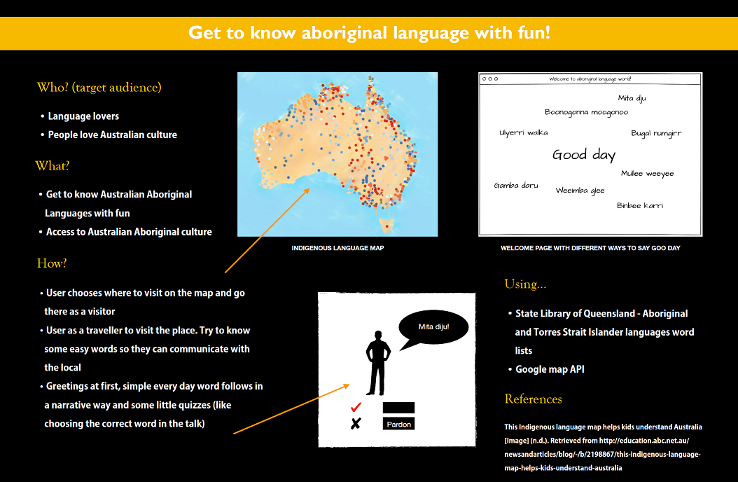
The design exploration is to explore data and find interesting ways to present the QSL data. I was required to design a poster and give a pitch to show my idea.
Because of my late enrolment, it was a bit challenging to generate ideas at first. It was so kind of Michael to talk with and inspire me. The dataset I chose was Aboriginal and Torres Strait Islander languages word lists. I suppose it would be great for language lovers to learn a new language in an interactive way. Besides, the Aboriginal language is also a way to learn their culture. According to the content of the dataset, the application would show some basic and simple vocabulary and sentences like how to say Good day.
The user would use the application as a visitor first came to this place. There would be engaging conversations between the local and the user. The user, as a visitor, could learn the Aboriginal language in an interactive way.
Major Project : Part A
Presentation Assessment
In part A, it is required to make a design proposal.
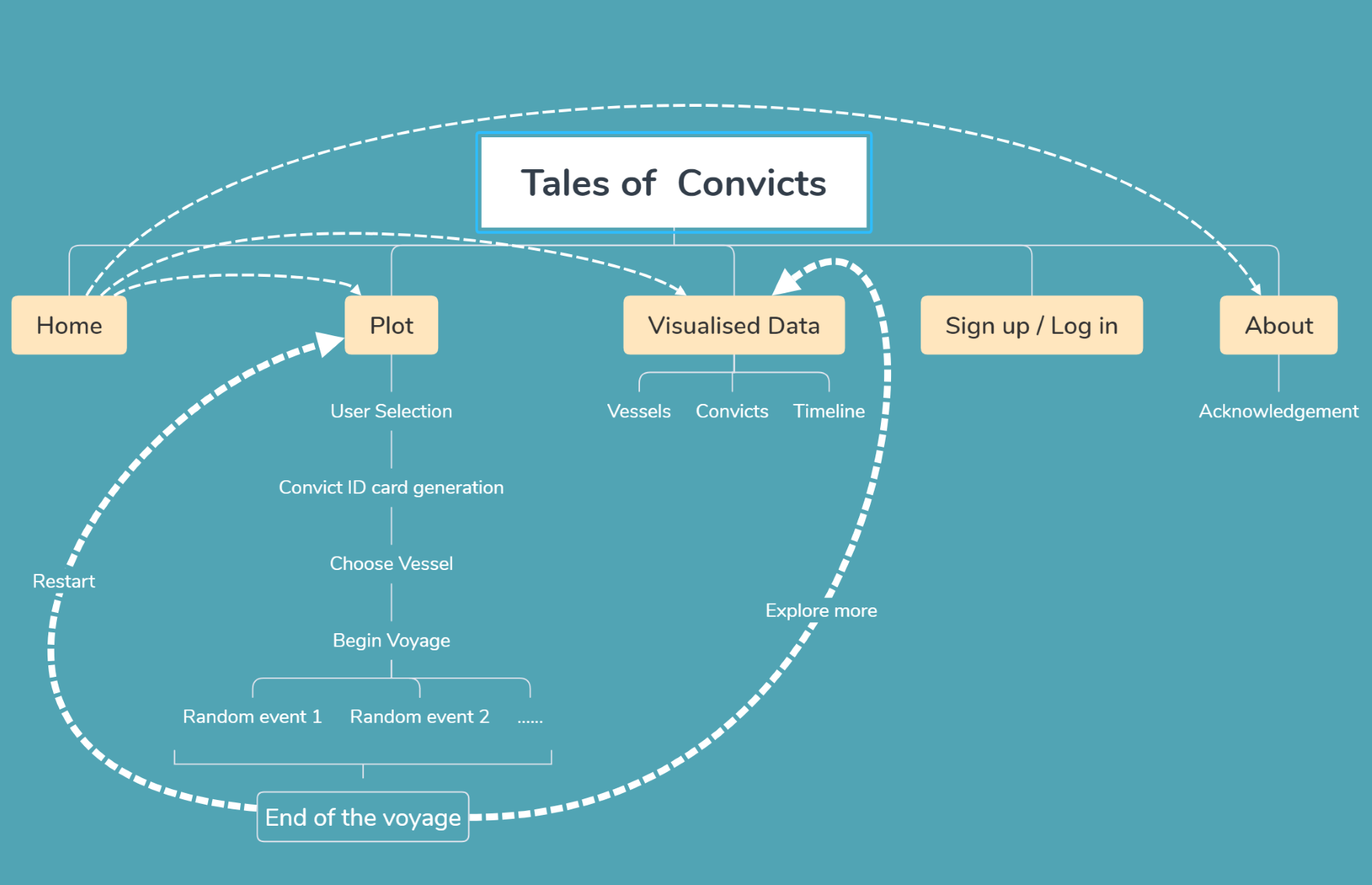
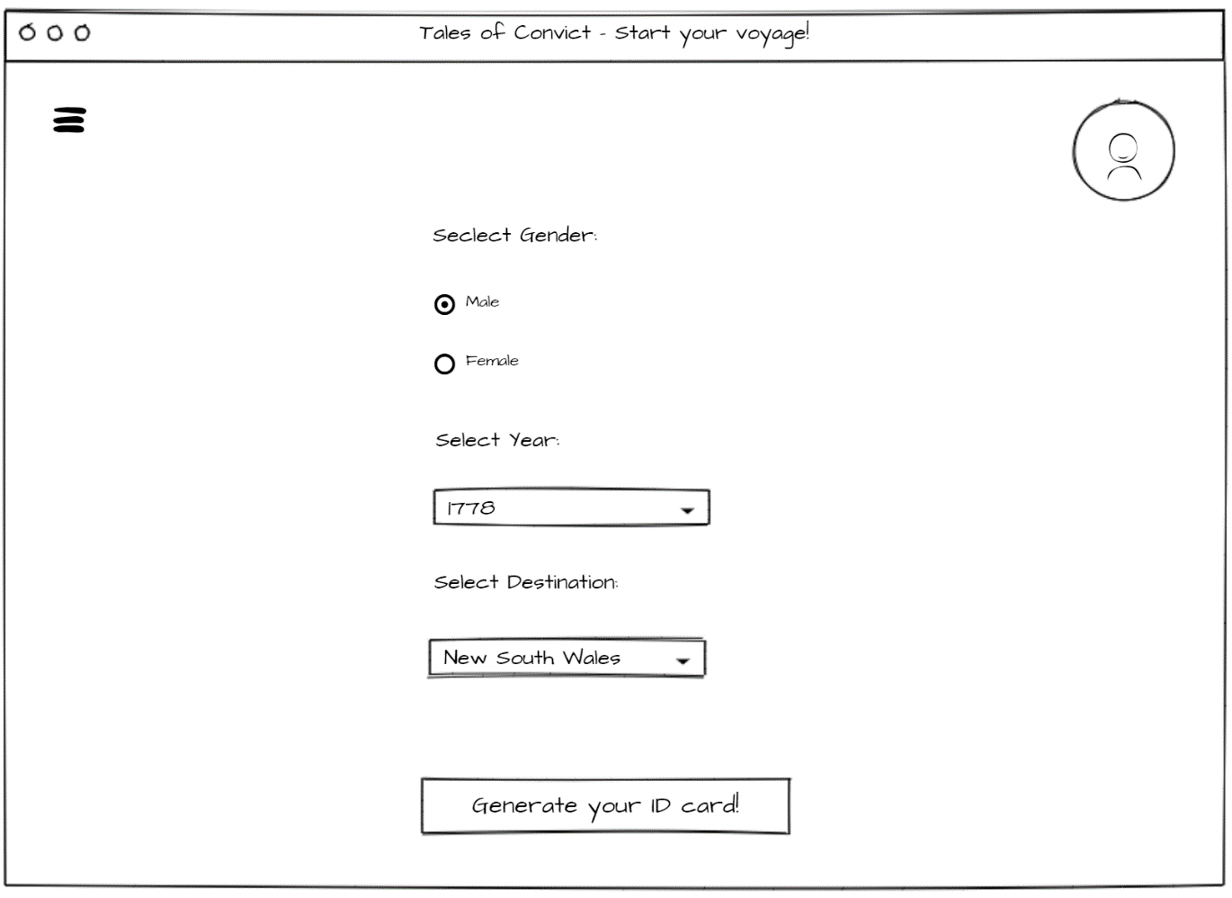
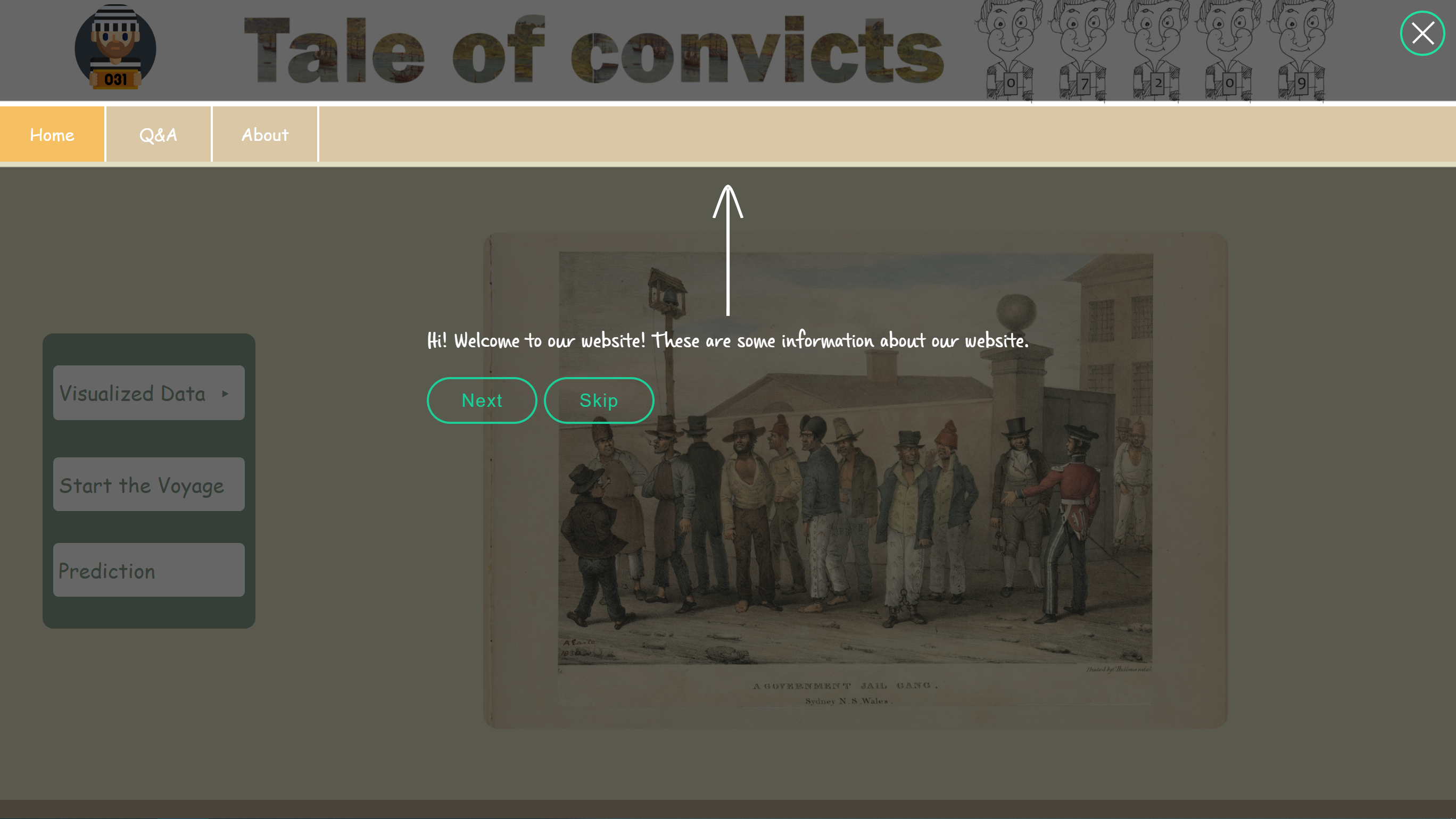
After discussion with my teammate Chao Lin, Huiyu Zeng, Xuefeng Liu and Jiasheng Li, we decided to implement a website about the Australian convict history called Tale of Convicts. The dataset going to be used was British convict transportation registers, which includes attributes like name of the convict, date of departure, destination and vessel.
The main feature of our website is to take on a journey from Britain to Australia as a convict. Besides, the user can browse some interesting data by different years, states and vessels. Considering we are taking Data Mining this semester, we also want to implement an advanced feature, predicting if the user is descendent of the British convict.
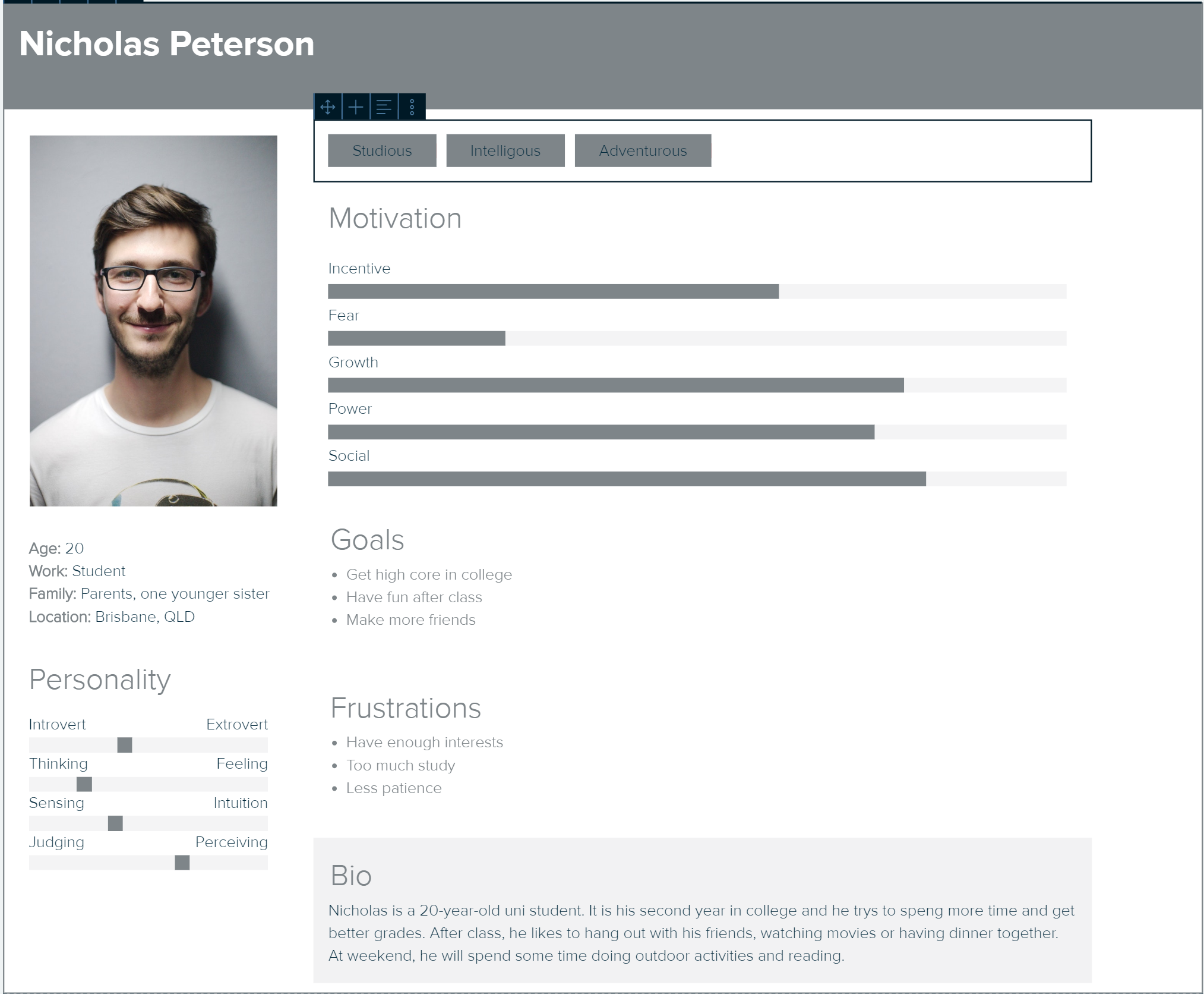
To present our proposal, we complete a concept document and make a pitch at class. As I didn't speak in the pitch part, my main job is to complete some part of the concept document like persona, site map and wireframe.
Major Project : Part B
Demo Assessment
Part B required us to present a demo like an MVP, showing what we want to and what we can implement at the end of the semester.
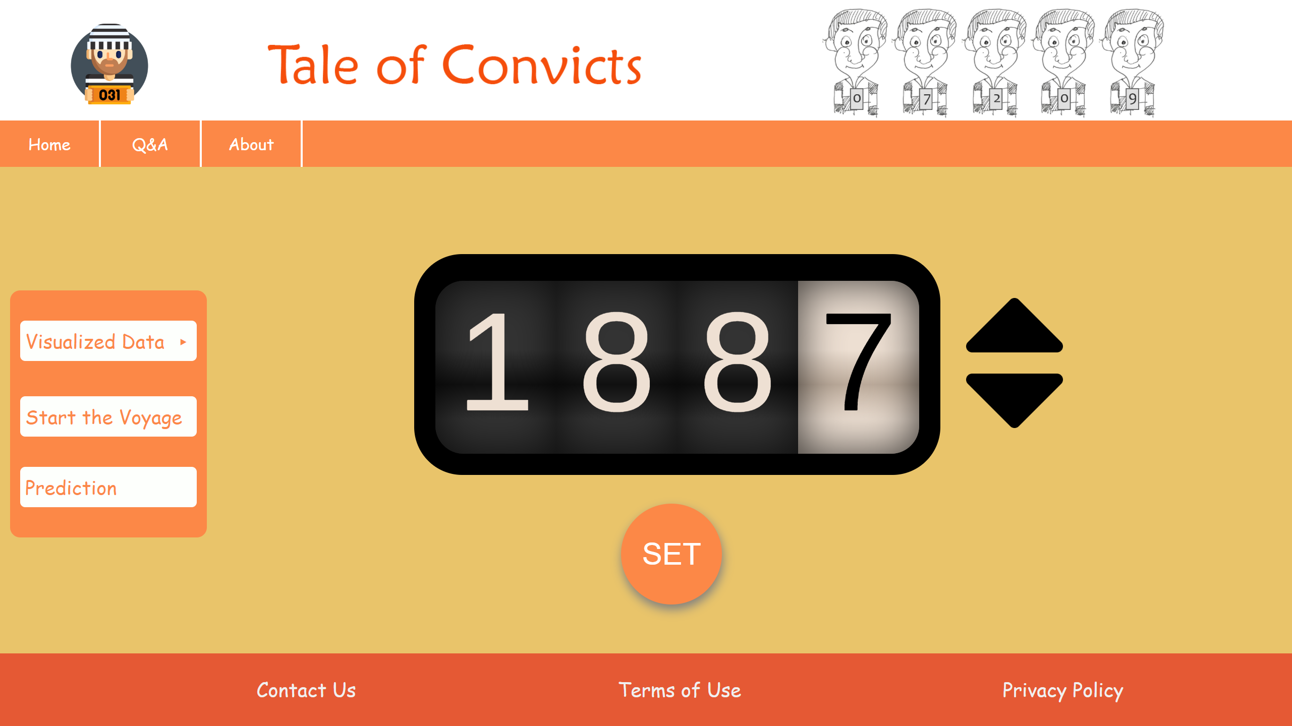
As a coder, I was required to implement the prototype the designer provided. We built the framework of the website and divided the workload into four parts as there were 4 coders in our team. I was in charge of the Sort by Year part.
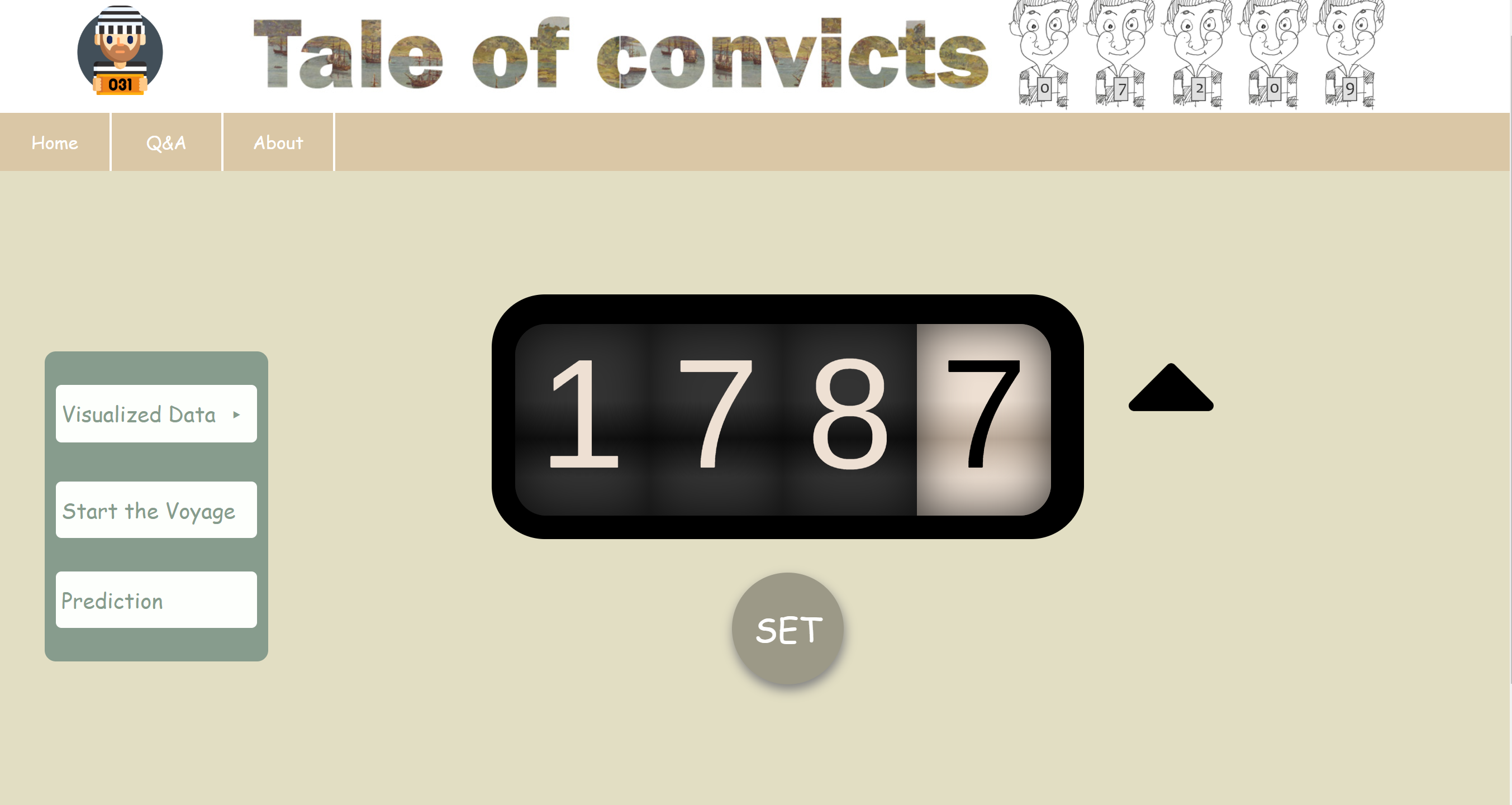
Along with the CSS part shown in the images, I used a JS and CSS library Odometer to show the scroll effect of the year selector. I wrote some JS script to make the year number scrolled by clicking the up and down arrow, and PHP to transfer the year information between two pages.
In this part, the year could be selected as any year like 0000 or 2020, and the color scheme hadn't been considered. The website still looked low-fidelity, but it showed the idea of our final product.
Compare to the site map in Part A, we cut down the Sign up/in feature as we saw little usage on our website.
Major Project : Part C
Final Product
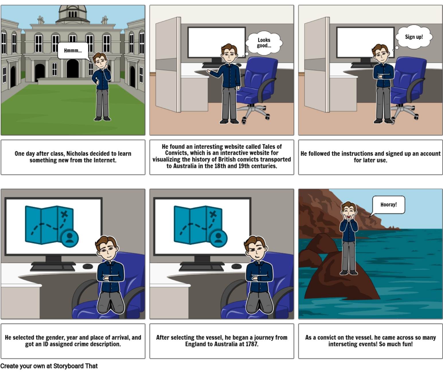
Our final product is hosted on the uq zone https://deco7180-c01t08.uqcloud.net . In our final version of the website, we have changed a lot from the one in MVP.
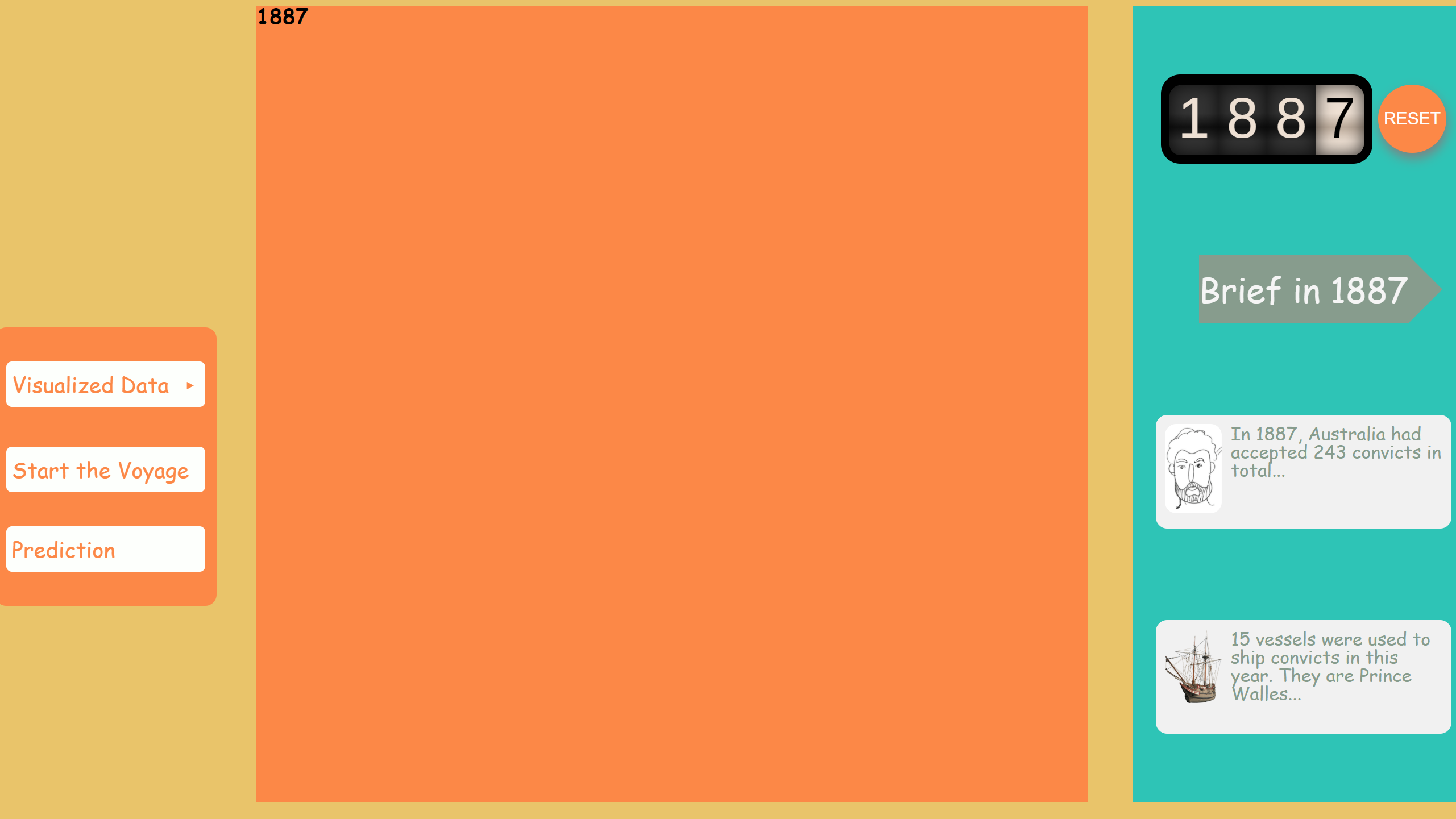
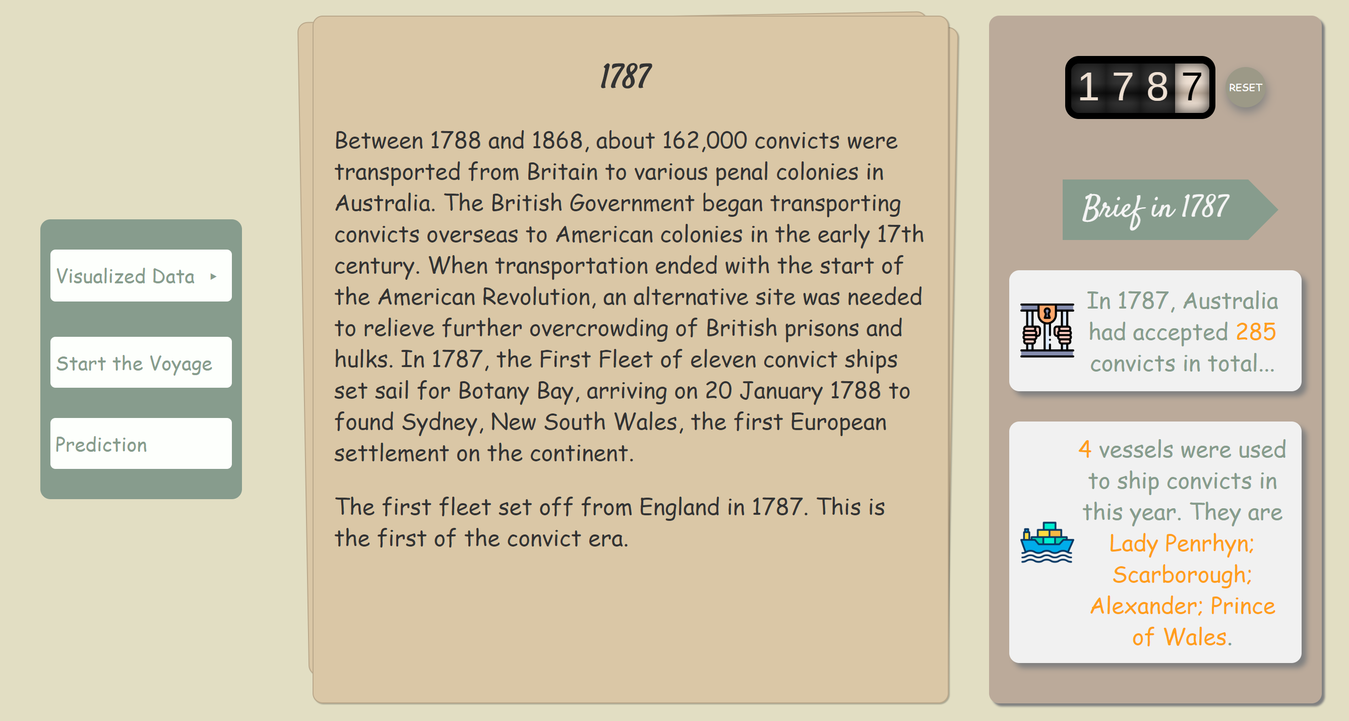
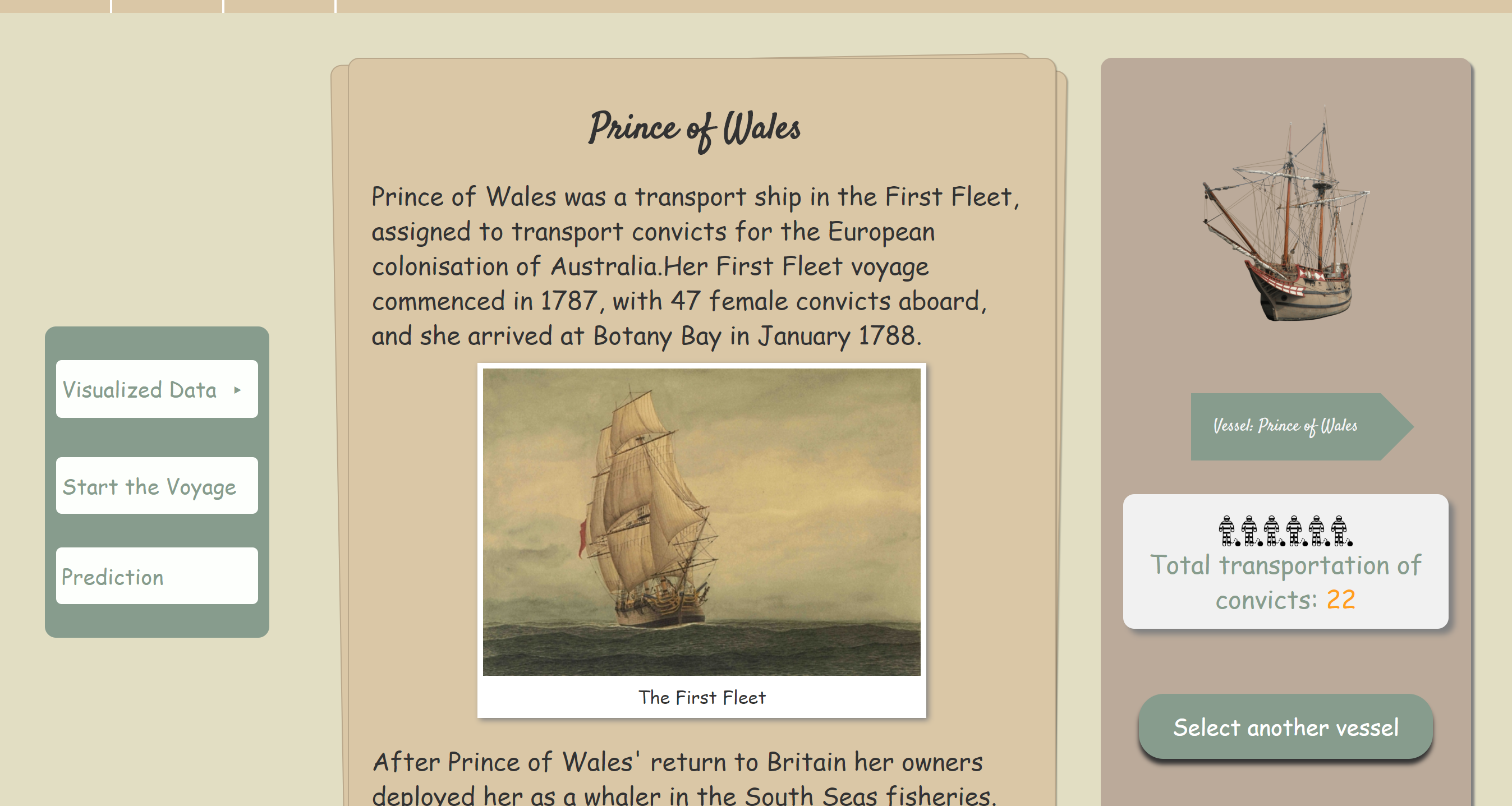
The most obvious one is the color scheme thanks to my kindest teammate Huiyu, which makes our website more fit to the historical theme. Besides, we changed the CSS part and the layout of the content a lot. I chose some of fonts we use and added some interactive animation effect to some clicking part. Furthermore, I made the article section a paper stack effect, so it looks like a pile of paper and the paper shown is according to the year or state the user selects.
I modified the year selector as well. I got some feedback said that the user may be confused about the year range and easily chose a year in which no data can be presented. At present, the user can only select years from 1787 to 1867 which is the exact convict era and the year range in the dataset. The up or down arrow will disappear at 1787 and 1867 to indicate the user it is the start or the end of the era.
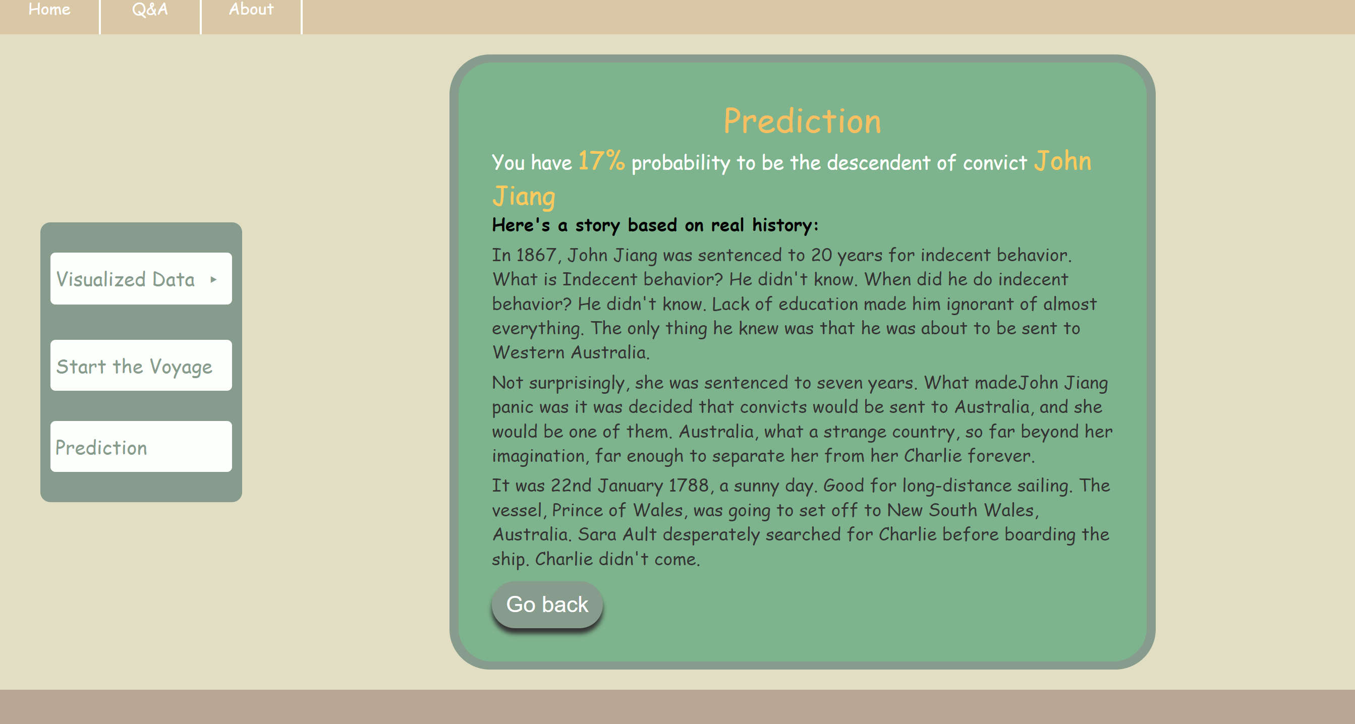
Last but not least, I wrote three short stories about the convict according to the real history. The name, crime, sentence year and vessel the convict was on are all true with some plot I made up. I think it is really interesting for users to know a person at that time would be sent to Australia just because of stealing oranges. It just gives a peek of that time but from this part, people who are interested can find more about this part of history.
Major Project : Part C
Trade Show and Conclusion
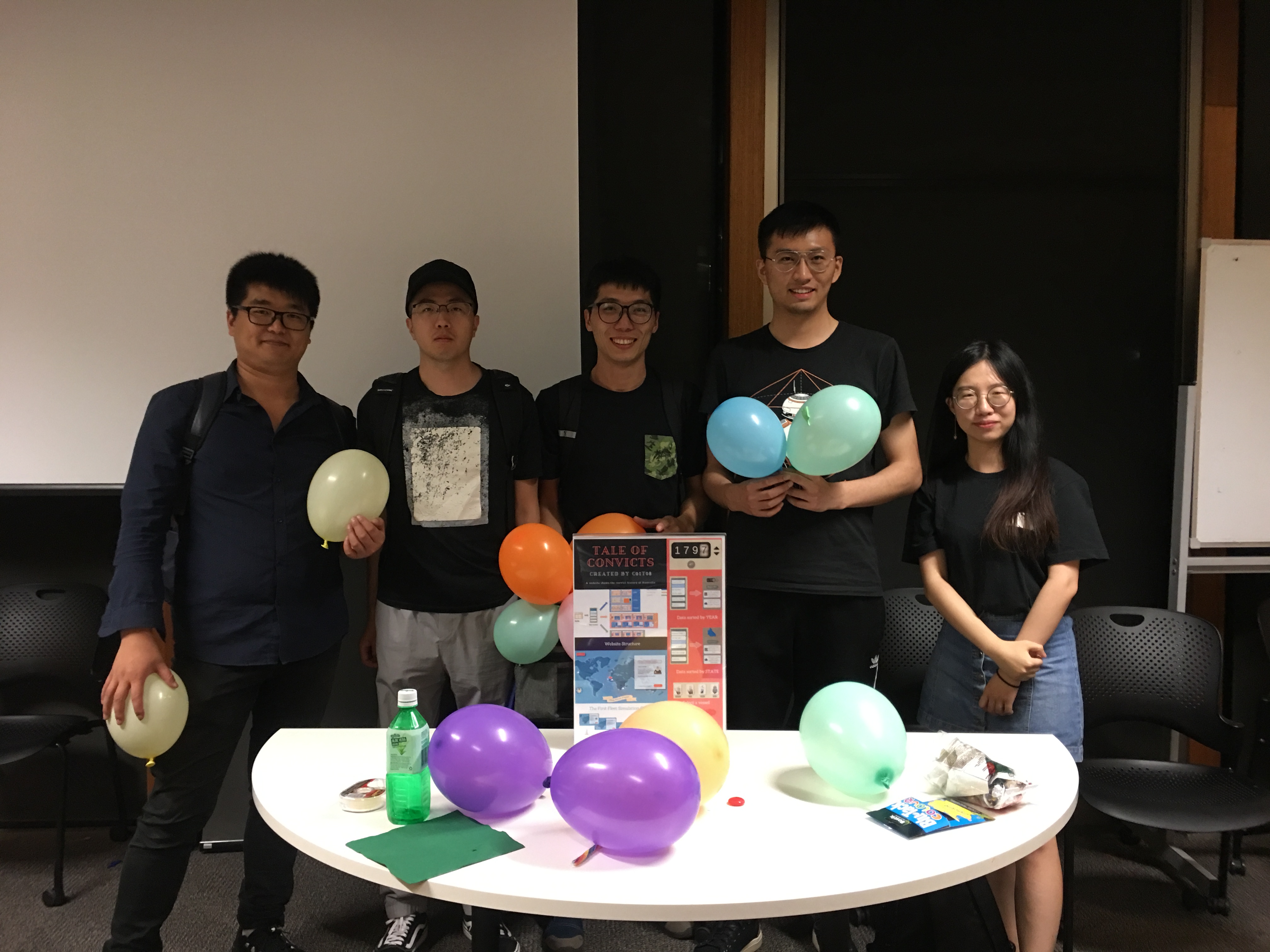
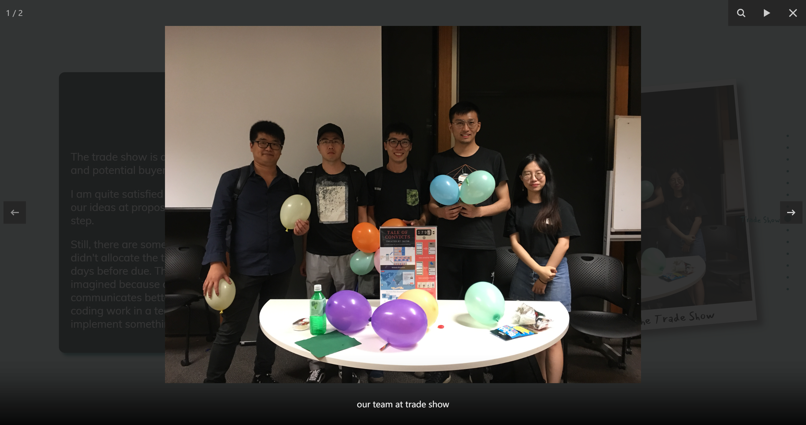
The trade show is a great chance to present our final product to the public and potential buyers. It was a big success and we got a lot of stickers!
I am quite satisfied with the final product we produced. It realises most of our ideas at proposal and it is really great to see them came true step by step.
Still, there are some parts we can improve in our future study and work. We didn't allocate the time very wisely, which made us in a hurry at the last few days before due. The plot section of our website is not as attractive as I imagined because of the lack of time and technology. We could communicate better and thus did a greater job. It is our first time to do a coding work in a team this semester, I believe we can do better and implement something really fancy next time.
Participation & Journaling
I'm glad that I attend all the sessions and able to learn a lot from it.
It is great to meet so many kind tutors and peers in my contact class, which makes me from a total beginner of studio class to a more experienced (in some part) studio participant. We discussed a lot, exchanging ideas, and finally all sharpen our mind.
The workshop class taught me a lot of technical skills thanks to Michael. I learned PHP, API and JavaScript knowledge which are all useful to my future study and work.
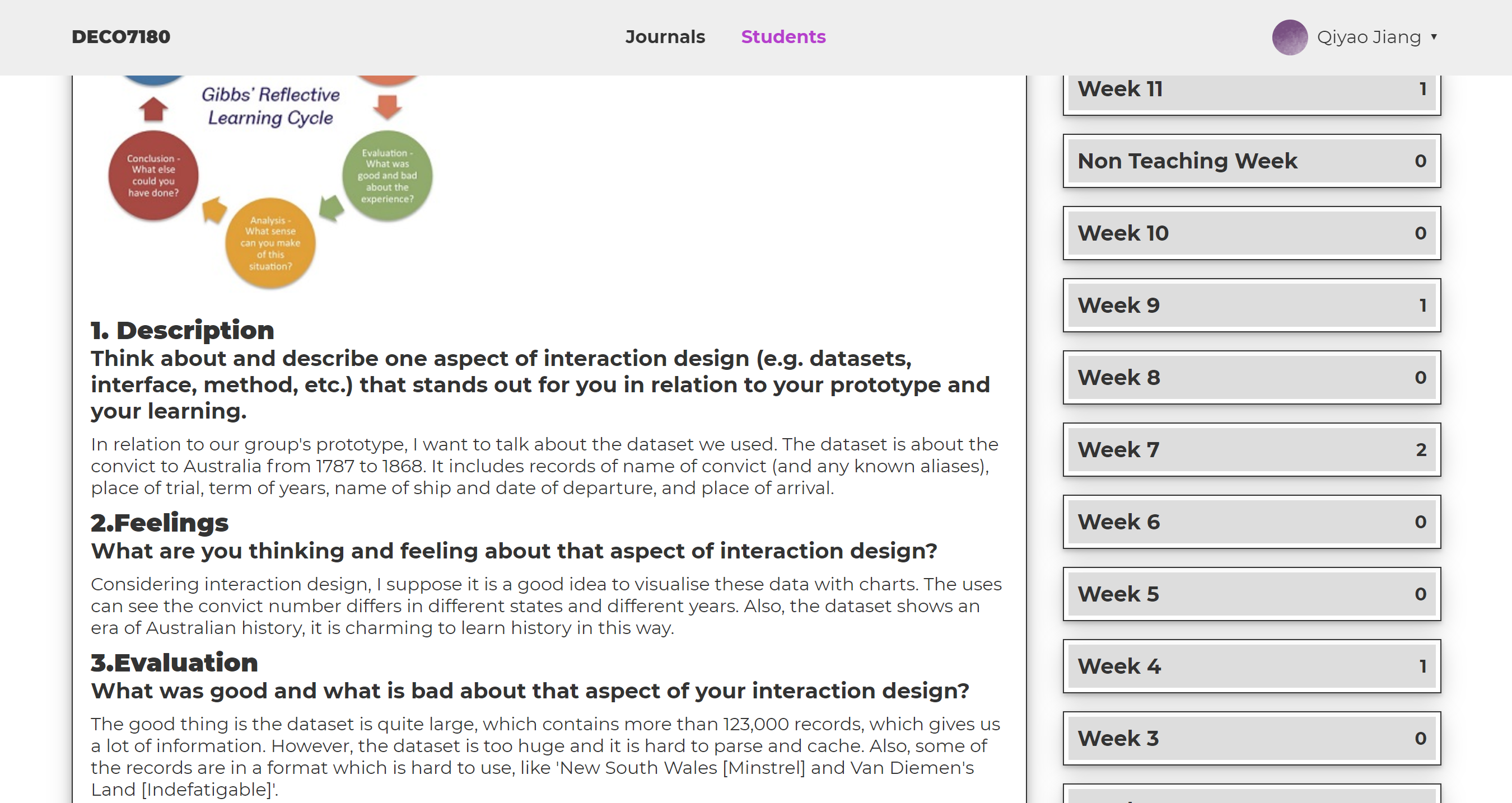
The journal part is a good way to keep a record of our ideas. We are more forgettable than we think. When I looked back on all the journeys I wrote this semester, I found the evolution of my idea.
Portfolio
The portfolio is the final demand of DECO7180 to show my individual work.
Finally, I can use the knowledge learned from this semester and make a website all depends on my individual ideas. Though I am not a designer and have quite few knowledge about designing, I have tried my best to make it feels better.
I use some JS plugins to present scroll down effect, the image slideshow and modal box. I wrote CSS all by myself and try my best to make it the one I want.
Hope you enjoy it!
Following are the course reflection of DECO7180
Design Computing Studio 1
Interactive Technology...
Meeting Expectations
Because of the late enrolment to this course, I hadn't wrote my journal until week3. Actually, I am not quite sure about the requirement of journal in week 1. I can still talk about my original expectations though.
At first, I chose this course just because it was a compulsory course for the master of IT. I am a coder with little sense of designing and like back-end coding much more than front-end. To be honest, I didn't expect too much when I chose to late enroll to the course.
The expectations changed as soon as I attended a workshop class before enrolment. I found that I could learn something interesting from the course more than I expected.
Then after all the meaningful events at contact and useful technical skills at workshop, I found myself quite enjoy this course already. From this course, I understand the meaning of teamwork, and how important for both designers and coders to make a product user-centered. I found myself more interested in front-end than before.
I am really glad I chose this course and complete it quite well :)
Learning across the Course
The contact session is a good way to communicate. Activities like World Cafe helped me to exchange opinions with others. The pitch assessment at class gave us a chance to learn from others' ideas and get feedback of ours.
The workshop session taught me knowledge about PS, PHP, JavaScript and API. I have gained some PHP skills from the course Web Information System last semester, but I like it better with the way taught in this course.
Feedback
In my opinion, the assessment detail of each part could be more clear to see. For example, I can not find the detail requirement of week 1 journal. The course is great and all the teaching staffs are kind and willing to help. Thank you so much!
For myself, I should learn to communicate with my teammates better in the future. Also, I should allocate my time more wisely for this kind of semester-long project.
Time is money, friend! - World of Warcraft
Other Work
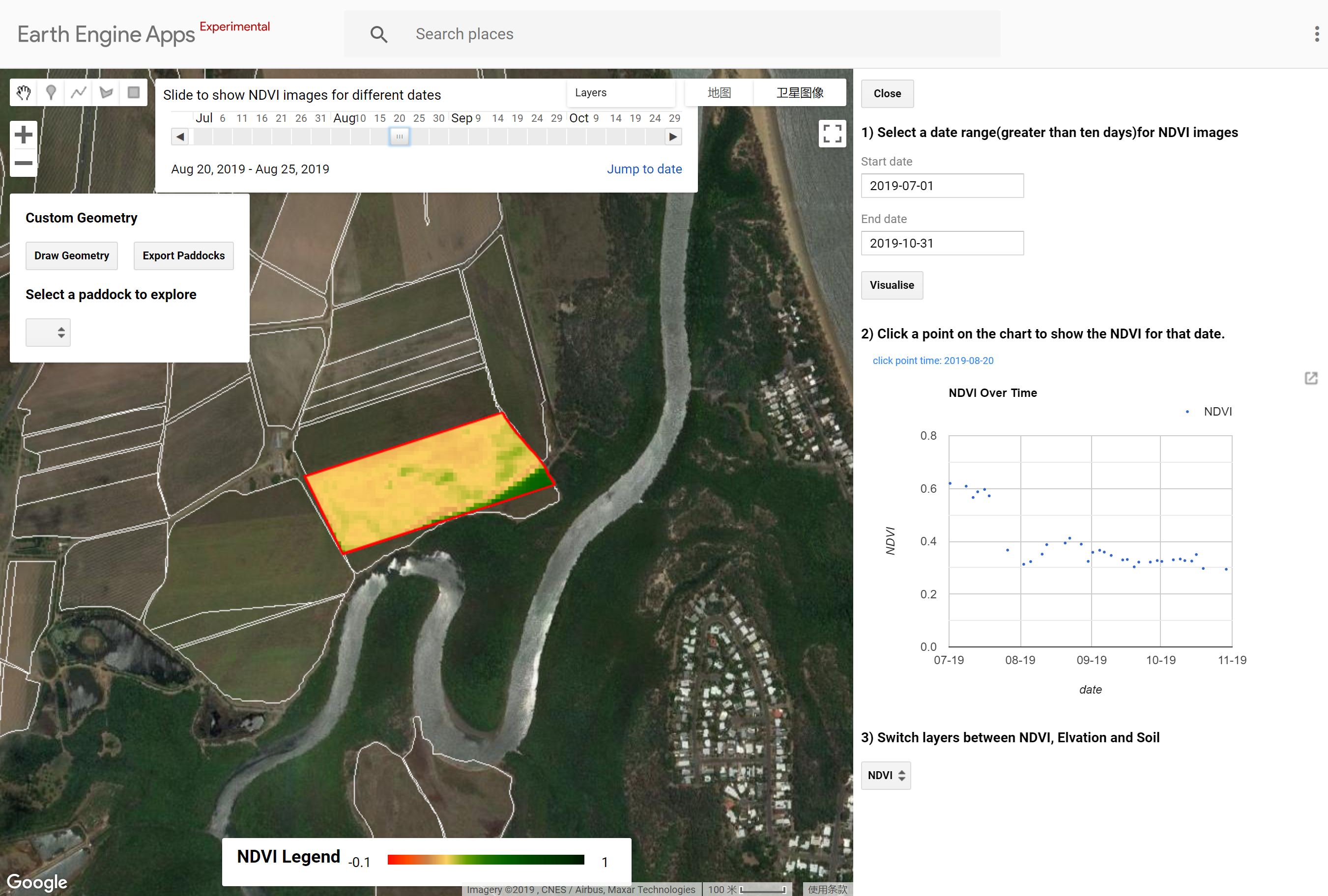
CSIRO Project - SugarByte
We also helped CSIRO to develop a web application based on Google Earth Engine this semester. Everyone can access the app from https://balddinosaur.users.earthengine.app/view/csirosugarbyte
SugarByte, a satellite-based crop monitoring platform, aims to help farmers in northern Australia know better about their paddock and minimize the usage of fertilizer. As runoff of unused fertilizer from sugarcane farms is an important factor of the Great Barrier bleaching, SugarByte can also help to prevent this.
Our informative website (implemented by Wei Chen): https://balddinosaur.uqcloud.net/
Acknowledgement
Reference
Beetson, S. (2019). Week two: Contact Slides [Powerpoint slides]. Retrieved from DECO7180, University of Queensland Blackboard Online, http://www.elearning.uq.edu.au/
JavaScript Plugin
fullpage.js retrieved from https://alvarotrigo.com/fullPage/#page1
Cycle2 from http://jquery.malsup.com/cycle2/
fancybox3 from https://fancyapps.com/fancybox/3/